schoolSpirit
stay active on a digital campus and connected to those who share it
MY ROLE
This was a UX project I worked on passionately at the start of COVID-19 in April, 2020. At the time, there were not many platforms that resonated with students and staff to allow them to keep in sync. I wanted to better connect today’s students with their digital and real world experiences.
While developing this project, I learned a lot about the success of utilizing different approaches to make things happen. While producing user personas and journeys, hand-drawn UI sketches, digital LoFi wire frames, administering test session prototypes -with REAL people on real devices, analyzing data, and HiFi displays, I was able to focus on clear user-centered design.
Purpose
The state of education was compromised by a number of factors due to COVID-19. For students wanting to continue their success in school, a list of support requirements has also created an opportunity to find solutions.
While learning from home in a hybrid or fully online model, students were in need of ways to connect to their campus while enriching their school experience. After all requirements were understood, my purpose was clear: Create a valuable experience for today’s students.
The Needs
Focusing on solutions
My initial stages of planning were reserved for user interviews and personas, analyzing student pain points, and utilizing google analytics to drive features based on creating solutions for a more personalized experience.
This project’s solutions are based on fulfilling the needs of people particularly in the area of emotional connection with their school.
designing for today’s students in tomorrow’s world
My initial stages of planning were reserved for user interviews and personas, analyzing student pain points, and utilizing google analytics to drive features based on creating solutions for a more personalized experience.
This project’s solutions are based on fulfilling the needs of people particularly in the area of emotional connection with their school.
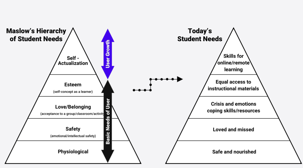
Maslow’s Hierarchy of Needs optimized for students.
in their digital seats
Meeting with students helped me understand their academic and social challenges. Together, we identified areas to enhance their experience and align their requirements to create solutions.

I gained valuable insight while working with students and documenting their feedback in real time.
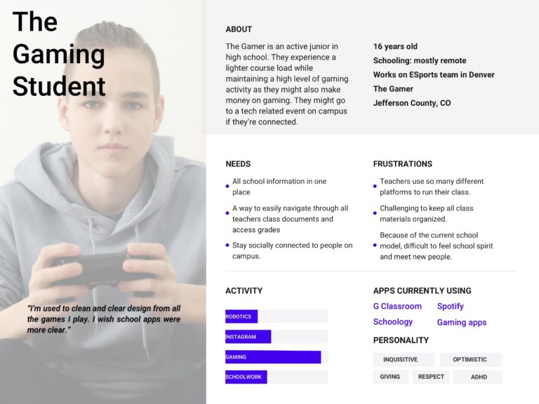
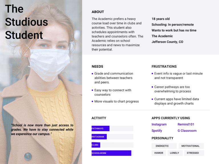
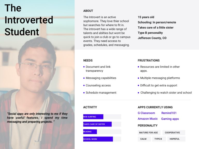
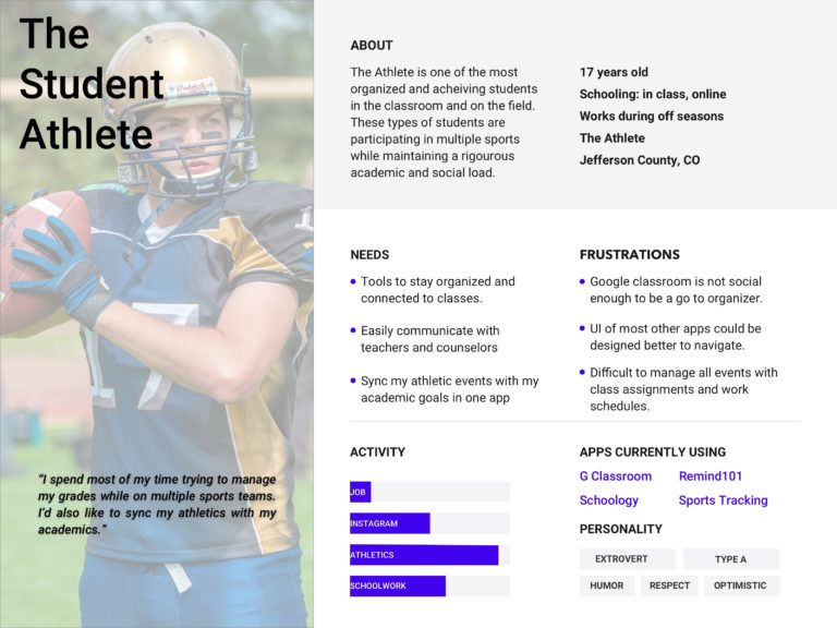
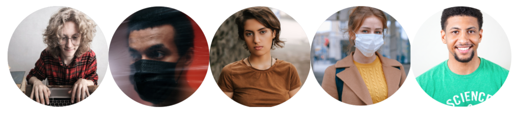
Persona Hypothesis
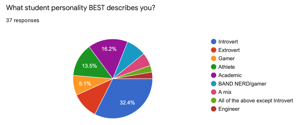
Before interviewing students, I predicted there would be different types of user profiles based on their connection to school. I wanted to capture 4 different types of personas after I interviewed and analyzed metric data from students.
To capture personas, I collected data using a Google Form on three basic prompts :
- Which student personality best describes you?
- Click/add all student features that most interest you.
- Click/add any common school challenges you might face.
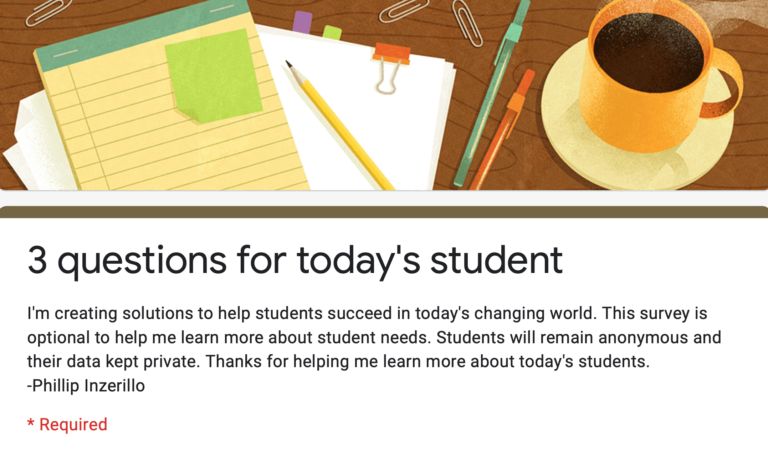
Screenshot of the heading for the Google Survey I sent to students.
Screenshot of metrics utilizing Google Forms as a free resource.
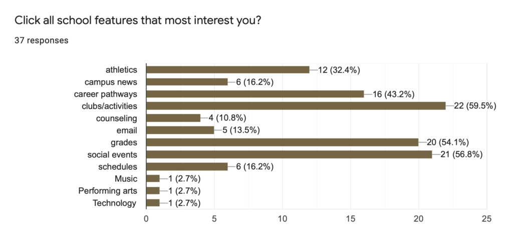
Students “added”: counseling, technology, & music.
‘School’ Redefined
Using my network base of primary industry partners, educators, and administrators I worked closely with, I learned a lot about current school models. Students’ journeys through school have changed dramatically. Schedules have been modified, students and classes have been organized cohorts, and the social angle of school has been completely redefined.
I interviewed over 50 students and captured profiles on 37 students aged 15-38 years. I recorded data before populating the metrics used for my persona hypothesis.
California schools were completely remote with no option of in person learning regardless of grade level. Arizona, Texas, and Colorado schools were reintroducing students based on 2 week groupings with the option of remote learning. Even with schools reopening, there were students with high anxiety levels worried classes will close again.
I know based on data that there were numerous types of students associated within a school environment. The data reflected multiple types of students, which I filtered down to 4 category types.
Digital Spirit
I used persona journeys, Google surveys, and user flows to visualize and communicate the user’s needs across various touch points within the app. This strategy allowed me to represent user pain points and see where support was needed.
Analyzing requirements was a valuable way to address expectations during emotional states:
- Other apps need more UI love
- Apps need profanity filters
- Great to see Google offer a closed caption option
- More apps need to cater to social and academic audiences
- Counseling resources needed
- Easier way to connect campus events to personal schedules
- Some apps are too cold or lack personality
- Most other platforms feel impersonal
connect to school with purpose
This app is a true-hearted approach to providing students with a solution to staying active on a digital campus, and connected to the people that share it.
Today’s learners will be the leaders of tomorrow. Most people don’t mind learning independently, however, nothing can replace the value of in-person connections.
Students and staff understand the ocean of ed tech and can be overwhelmed at times with the amount of cross platform systems. Although LMS (systems) is one current solution, there are areas to expand and improve the user’s experience while utilizing the features and style of these apps.
schoolSpirit is a familiar and inspiring tool that will support all types of learning while keeping students connected to their school environment.
The Requirements
working Agile with real people
I am skilled in working in an Agile environment. And while working on school campuses proved challenging, I still made progress.
The design went through changes based on feedback, so it was necessary to be flexible and adaptive. Newly addressed standards of public education and proposed hybrid models were announced abruptly. It was important to stay agile to produce solutions in this context until the end.
My research and testing served as a foundation to establish elements within the UI and features that were expected.
I know based on data that through ideation and iteration, students’ needs could be met while delivering a positive experience. Interviewing and testing the users in the classroom and designing to their experiences and journeys was a valuable approach.
The life of a student
Learning from students allowed me to discover the various range of home setups and environments. I realized the hour to hour lifestyle of the target audience and focused on what my personas want and need rather than just a nice interface.
Scenarios were created allowing me to focus on concepts I could connect with. Studying the life and scenarios of students served as a structure for the requirements and allowed creating from a functional and emotional filter.
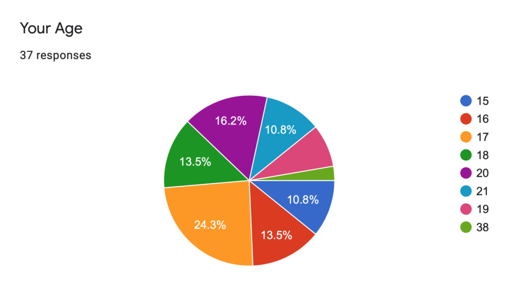
“Age” responses via Google Forms. 37 total submitted, ages 15-38.
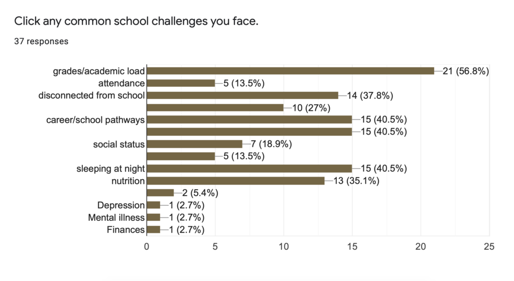
“School Challenges” responses. Users added: mental states & sleeping.
needs based on value
Research and simulating user environments allowed me to generate strong access points to features.
I prioritized and categorized access points to align with values. This gave me a way to visualize what existing functionality and content is useful, which points needed support, and what opportunities were available to optimize.
Using Maslow’s Hierarchy of Needs and an adapted school model, I analyzed requirements and compared the needs of the student to their expectations.
app features
From a lack of parent support, to having to babysit siblings, or even work their own jobs, students are stretched. More than ever, there was a need for easy access to school materials and a way to connect to teachers.
To further develop the resources within the app, I implemented a set of experience principles.
These were used to legitimize design decisions, iterate core values, and describe qualities the app experience should uphold for both the students and their campus.
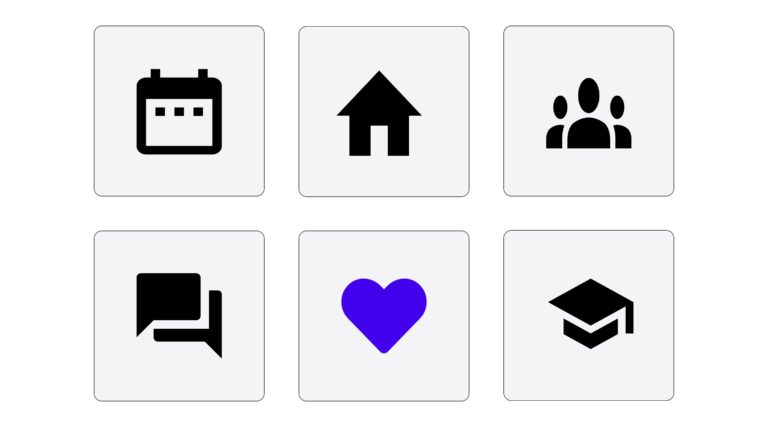
I made decisions on final feature icon sets after multiple A/B tests.
The framework
establishing the design process
Research and simulating user environments allowed me to generate strong access points to features.
I prioritized and categorized access points to align with values. This gave me a way to visualize what existing functionality and content is useful, which points needed support, and what opportunities were available to optimize.
Using Maslow’s Hierarchy of Needs and an adapted school model, I analyzed requirements and compared the needs of the student to their expectations.
app features
From a lack of parent support, to having to babysit siblings, or even work their own jobs, students are stretched. More than ever, there was a need for easy access to school materials and a way to connect to teachers.
To further develop the resources within the app, I implemented a set of experience principles.
These were used to legitimize design decisions, iterate core values, and describe qualities the app experience should uphold for both the students and their campus.
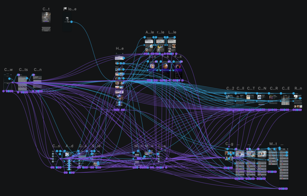
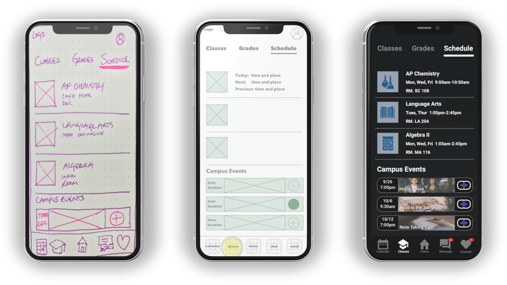
A digital userflow outlining the navigation throughout the schoolSpirit application.
The design process spanned multiple stages of implementation, prototyping, and testing.
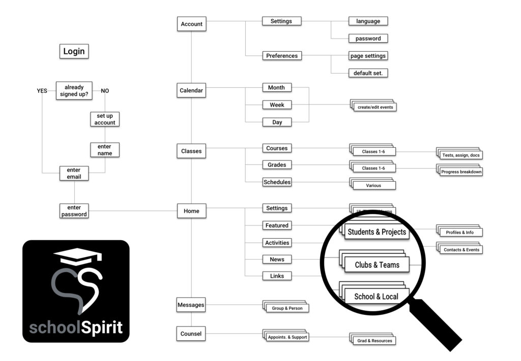
I set the architecture using Jesse James Garrett’s Visual Vocabulary wireframe pathways.
Usability testing at this wireframe stage ensured testers’ focus on the real ingredients of information architecture and flows.
Based on data, I developed a Hi-Fi proto for more accurate testing at a latter stage.
School spirit in an app
After considering all feedback from students on the aspects that create their day, I continued to craft user journeys in the app. The ability to conceptualize the life of a student and the multiple activities they are part of on campus is massive. As more learning has moved online, I wanted to meet the needs of the user where they are.
User Interface (UI)
The UI decisions were based on the feedback from testing sessions. Students related their experiences to other UIs that were intuitive for them but never really seen in an education app. Color choices and palettes were largely left neutral because they are subject to change to fit the brand of whichever school is hosting. I primarily focused on providing a clear and easy way to navigate through the features that users felt were valuable.
Because of our diverse readers, the typography was based on Google material, Roboto font.
A dark and light theme were prototyped to offer high contrast and increase legibility in outdoor, low-light conditions. The design allows for modified content with the room to expand and improve. Largely users preferred dark theme variations.
My design decisions helped to build confidence in the tested group of students based on their feedback.
muri mura muda
I utilized a proven effective Japanese business model while designing this product.
Muri (excessive): Originally, the homepage layout consisted of 3 vertical columns featuring images of school activities, teams, and clubs. There was also a video playing at the head of the page. I learned from initial A/B testing that a 2 column grid of images with a deleted video was calming and clear.
Mura (uneven, without balance): I learned after A/B testing that users preferred UI elements that were spaced apart rather than more features packed into a single view. Users liked to scroll in this app, so designing with more space also allowed me to follow the Von Restorff effect.
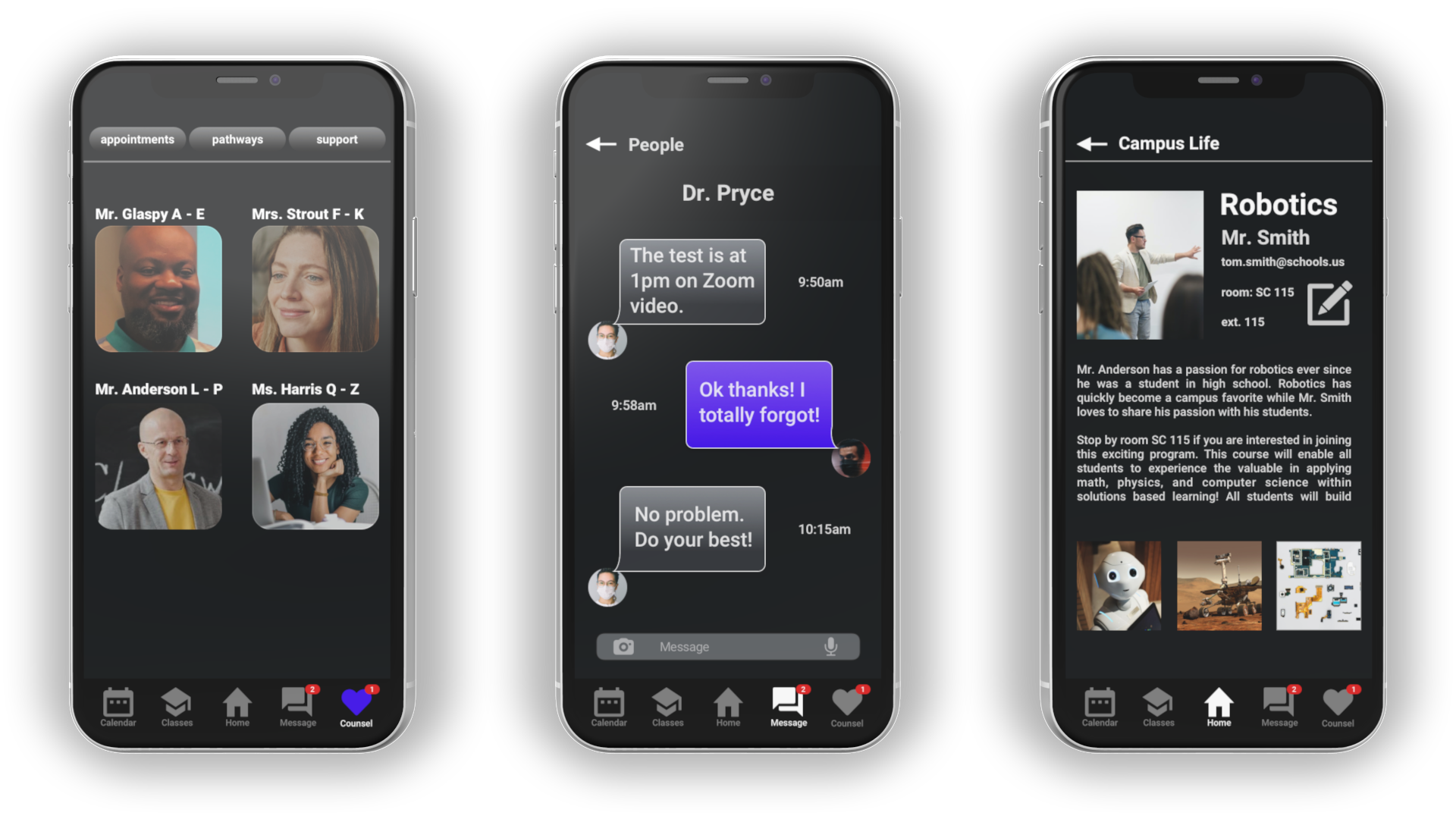
Muda (waste): In the initial design stage, I implemented an email feature. After A/B testing, users preferred the features of a counsel section and reported an email section was an over saturation of their communication needs.
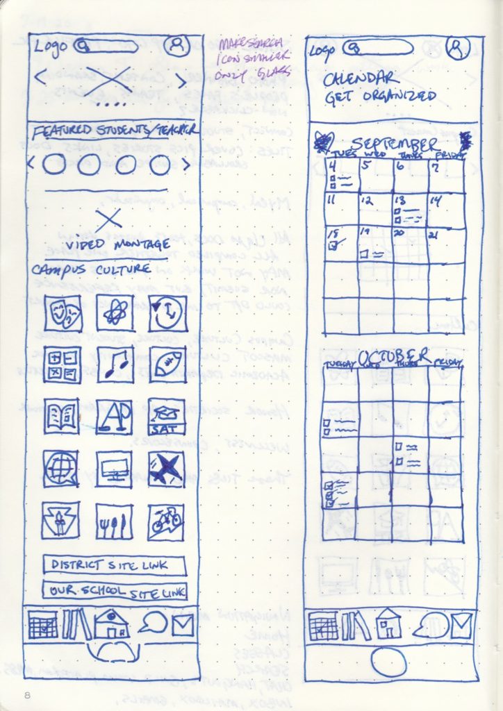
Early sketch showing Muri (excessive) on left while Muda (waste) on right shows undesired email icon in bottom nav bar.
Are student needs met?
I wanted to offer accessible career pathways and student profiles. Many hours were dedicated to establishing and executing production to inspire users to stay connected to their school.
With concerns over a quality and comprehensive school experience, inspirational and real student content and copy is used on featured pages where the users may be considering clicking to find more info. The content in these categories are always subject to modifications for best practices.
I learned to improve opportunities for access to campus events, students and projects, counseling, and career pathways support.
mobile prototyping: sketch + invision
More efficient tools are being created everyday to present the perfect prototype. Personally, I’m driven to explore all apps to find which tools are best for specific tasks. Each project’s requirements change the way I use my tools.
Sketch + Invision+ Anima proved to be the best tools of choice for prototyping this project. The prototype remains positively accepted for user testing trials because of its immediate feedback abilities.
The Hi-Fi prototype was a powerful tool in creating transparency in my design process and for obtaining true honest feedback with users interacting right in front of me.
My prototying tools are always evolving and continue to improve testing experiences.
Each user was briefed on what to expect from testing the prototype without giving away its features or navigation.
Metrics data was recorded while each user had 4 minutes to navigate solo on their mobile device with an InVision link.
I learned a lot about student needs through this process because the users gave quick and responsive feedback.
A thorough test on each user was performed with a script, google form, and the live mobile prototype. The results are based on 37 user tests.
The refinement
Discovering solutions alongside students
I worked with over 50 students and staff to define needs, establish requirements, and test the apps prototype. While socially distancing (challenging during testing), I tested real, random students on Pearl Street Mall in Boulder, CO and students in 4 states through my previous teaching network. People were incredibly open to providing feedback! I tested over multiple development stages of the project to ensure frequent quick feedback across design fidelities.
For a more accurate experience, I set to utilize a mobile version of the application using Anima prototyping with InVision. The test users revealed that not only was their experience testing the app realistic, but also fun, engaging, and pleasantly surprising.
The testing sessions were all administered by me in a consistent process along with organic peer observation while documenting all reactions and asking participants to walk me through their thought process while they engaged with the app. I time boxed their sessions and AVOIDED “helping” them navigate, all while recording their actions.
Bridging connections
Participants revealed the disconnect to school and the need for counseling over email within an app at an early requirement stage. There already exists established platforms to host student email, particularly with Google. My hypothesis was that featuring a standard email feature did not accommodate a strong enough value affordance to the user requirements.
Based on Google survey data and user interviews, I decided to PIVOT and redesign and test the counsel feature, which proved more discoverable and valuable.

Early navigation featured email and then replaced with Counsel access after user testing.
improving the nav bar
I know based on data from early user testing, the navigation icon selection did not convey a strong enough connection between the icon itself and the content within that category. This decision to pivot early allowed me to develop an A/B test for the different nav bars.
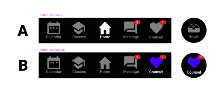
A/B Results were based on 20 additional tests. The data provided evidence of users accessing the counsel and class sections 50% more frequently in the updated nav bar than when using the the early icon choices. The home and counsel sections also experienced 40% more clicks per session with the updated nav bar accessing all of their most interested features.
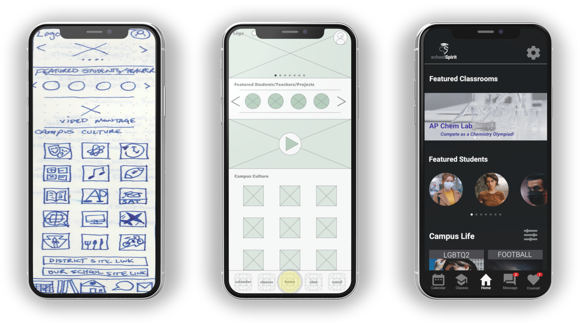
A home at school
The home screen offered primary functions with clear footer navigation and intuitive access points within a familiar UI. The size of the icons allowed easy viewing of details while considering spatial relationships and abilities to modify content and expand over time.
Stay connected
Specially designed for students to stay academically and socially connected to their school, users can depend on their prior experience with apps like Google Classroom, Spotify, Instagram, and Campus.
enhanced student experience
I learned that the needs of our students are greater than ever. The people I worked with to capture experiences have shared that they value this effort and product like this.
Although there are similar applications and some of their features are further developed, a comprehensive experience is something many students are reporting is lacking from school applications today. And that experience is largely based on their feelings of emotional connection.
Working through an Agile process, I welcomed new challenges and embraced moments to PIVOT on a decision.
My background has blessed me with the experience to make the best case out of challenging situations. I prefer to see the “silver lining” of all situations and rather succeed by doing, failing, learning, and growing.
The students, teachers, administrators, and parents I worked with on this project have been great. I’m thankful I’ve had the opportunity to develop and share this educational product.